Get this template
Ivet Dyulgerova
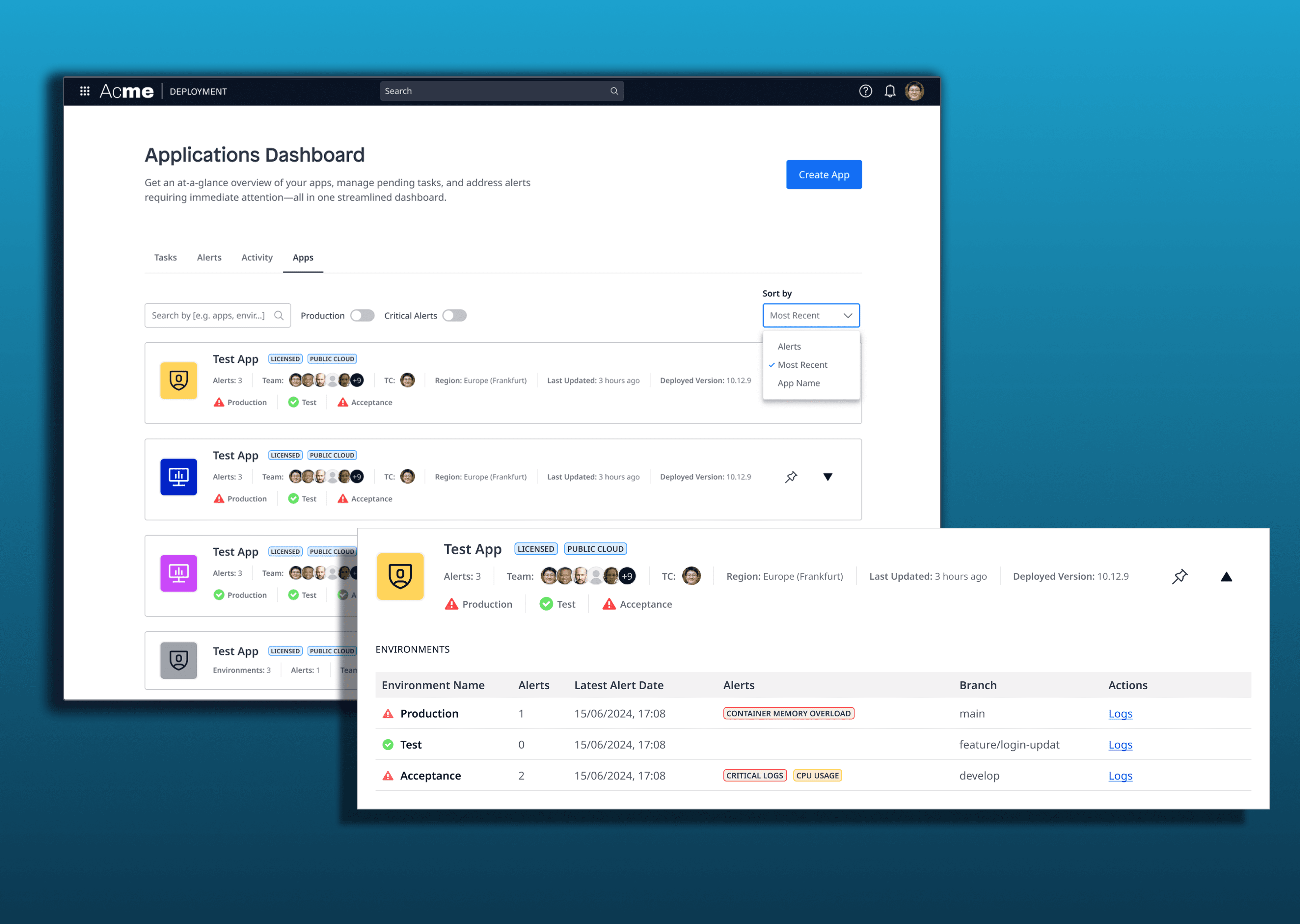
Application Management Dashboard

Due to confidentiality, only a limited portion of this project can be shared here. I’d be happy to walk you through a full demo and discuss this and other projects I’ve worked on in more detail during a call.
Scope
9 months
My Role:
Lead Designer
Year:
2025
Service Provided:
End-to-End Product Design User Research, UX & UI Design
The Challenge
The project focused on redesigning a complex application overview dashboard within a large SaaS platform used for deploying and managing multiple applications. The existing page had not been meaningfully updated for years and functioned mainly as a pass-through navigation layer rather than a destination. For Technical Contacts - users responsible for monitoring app health, environments, and incidents - this meant fragmented workflows, poor visibility, and constant context switching. The goal of the project was to transform this entry point into a central, actionable overview that supports real decision-making and day-to-day operations.
Research: What I Discovered (and Why It Mattered)
The research phase combined desk research, competitor analysis, heuristic evaluation, and stakeholder interviews with experienced internal users closely connected to real customer needs. Across all methods, one theme kept resurfacing: lack of visibility. Users were managing dozens or thousands of applications without a single place to understand what was happening at a glance. Critical information such as errors, environment health, and alerts was scattered across multiple pages, making fast reaction difficult. While power users wanted information density, newer users struggled with clarity - revealing a tension between depth and usability that became central to the design challenge.
Key Findings & Focus Areas
Main findings
The Cloud Home Page was used mostly as a shortcut, not as a working surface
Critical app information was fragmented across multiple views
No advanced filtering, grouping, or prioritization for large app portfolios
Alerts and notifications lacked a unified, actionable overview
Analysis & focus
Turn the page from navigation → destination
Create a single source of truth for app health and activity
Support both experienced and less-experienced users
Prioritize visibility, customization, and fast decision-making


Design & Testing: How the Solution Evolved
Design started with multiple concepts and wireframes exploring different ways to structure information density without overwhelming users. Early iterations tested split layouts and aggregated overviews, which revealed confusion around hierarchy and relationships between apps, environments, and alerts. Through several rounds of usability testing (both internal and external) the design gradually shifted toward a tab-based structure, separating Apps, Alerts, Tasks, and Activity logs. This reduced cognitive load, improved findability, and aligned better with users’ mental models. Each iteration refined what information belonged where, ultimately resulting in a clearer, more scalable dashboard that adapts to both small and large app landscapes.
Final Outcome & Takeaways
The final design repositions the dashboard as a central control point rather than a hallway. It provides Technical Contacts with immediate visibility into app health, alerts, and tasks, while allowing customization and filtering to support different workflows. Most importantly, it closes the gap between what administrators know and what developers need to act on - making the platform more transparent, efficient and trustworthy. The project demonstrates how research-driven, iterative design can transform a legacy interface into a meaningful product experience.
